| 일 | 월 | 화 | 수 | 목 | 금 | 토 |
|---|---|---|---|---|---|---|
| 1 | 2 | 3 | ||||
| 4 | 5 | 6 | 7 | 8 | 9 | 10 |
| 11 | 12 | 13 | 14 | 15 | 16 | 17 |
| 18 | 19 | 20 | 21 | 22 | 23 | 24 |
| 25 | 26 | 27 | 28 | 29 | 30 | 31 |
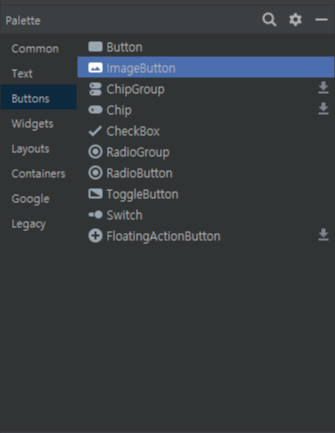
- ToggelButton
- button
- AutoCompleteTextView
- Professional Android
- TEXT
- EditText
- Application
- switch
- RaduoButton
- Kotlin
- Chip
- TextInputlayout
- layout
- manifest
- PlainText
- constraintlayout
- Android
- RelativeLayout
- intent-filter
- LinearLayout
- Guideline
- androidstudio
- TableLayout
- textview
- CheckedTextView
- FrameLayout
- GridLayout
- Today
- Total
근본있는 블로그
Design Palette 훑어보기 - Button편 본문
Buttons
Button
가장 기본적인 Button입니다. Activity에서 SetOnClickListener를 구현함으로써 버튼이 클릭되었을때 무슨 일을 할 것인지에 대하여 정의할 수 있습니다.
Chip, ChipGroup
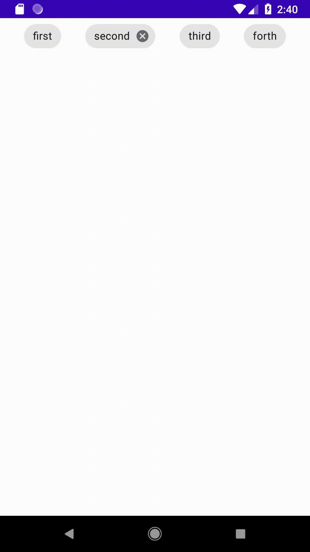
위에 보이는 4가지 버튼들이 chip의 4가지 유형입니다
순서대로 Action, Entry, Filter, Choice 입니다. 각각의 Listener를 이용하여 버튼들이 눌렸을 때를 구현할 수 있으며 ChipGroup을 이용하여 다수의 Chip을 관리 할 수 있습니다. 더욱 자세히는 추후에 따로 게시물을 통해 설명하겠습니다.
참고로 build.gradle(Module:app)에 다음 코드를 추가시켜 주어야하며
implementation 'com.google.android.material:material:1.1.0'
resource의 style을 다음과 같이 수정해주셔야 합니다.
<style name="AppTheme" parent="Theme.MaterialComponents.Light.NoActionBar">
CheckBox
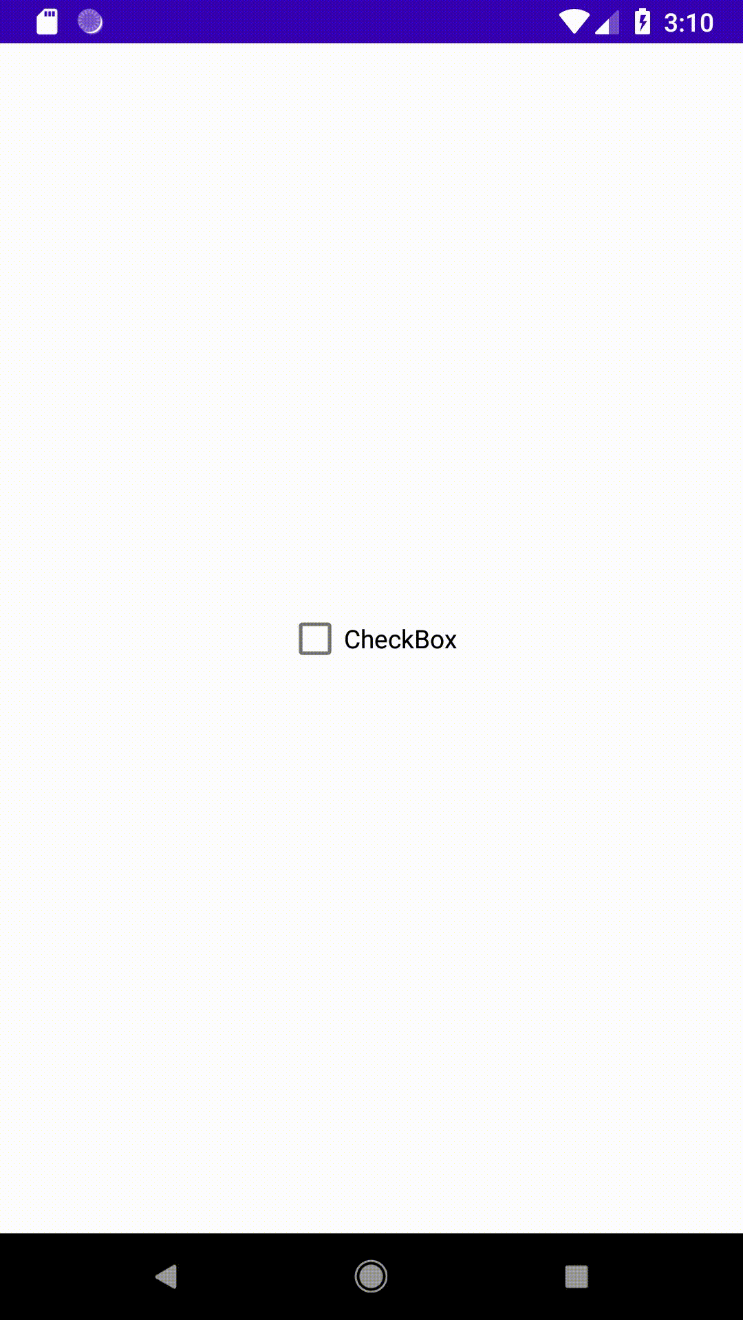
이름 그대로 Check가 가능한 항목입니다. 가장 기본적인 코드를 보겠습니다.
// CheckBox Code
package com.professionalandroid.apps.android_practice2

import androidx.appcompat.app.AppCompatActivity
import android.os.Bundle
import android.widget.Toast
import kotlinx.android.synthetic.main.checkbox.*

class MainActivity : AppCompatActivity() {
    override fun onCreate(savedInstanceState: Bundle?) {
        super.onCreate(savedInstanceState)
        setContentView(R.layout.checkbox)
        // setOnClickListener 설정
        checkBox.setOnClickListener{
            // check 된다면
            if(checkBox.isChecked)
                Toast.makeText(this, "checked", Toast.LENGTH_SHORT).show()
            // uncheck 된다면
            else
                Toast.makeText(this, "unchecked", Toast.LENGTH_SHORT).show()
        }

    }

}
xml 코드는 바꾼 것이 없어 올리지 않았고 위 코드는 버튼이 눌릴때마다 반응하도록 만든 코드입니다. 현재 체크 유무는 isChecked함수를 통해 알 수 있습니다.
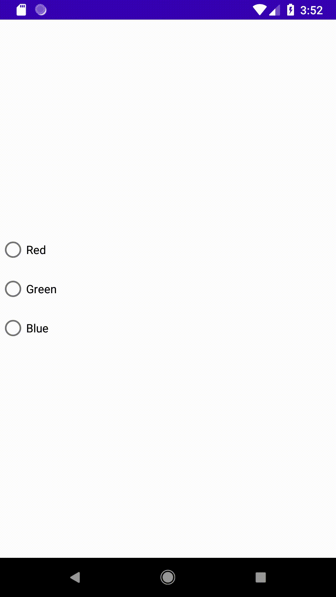
RadioButton, RadioGroup
RadioButton은 여러 항목 중 고르는 선택해야 하는 경우에 사용할 수 있습니다. RadioGroup는 여러개의 RadioButton의 관리를 용이하게 도와줍니다.
<!-- RadioButton, RadioGroup xml Code -->
<?xml version="1.0" encoding="utf-8"?>
<androidx.constraintlayout.widget.ConstraintLayout xmlns:android="http://schemas.android.com/apk/res/android"
    xmlns:app="http://schemas.android.com/apk/res-auto"
    xmlns:tools="http://schemas.android.com/tools"
    android:layout_width="match_parent"
    android:layout_height="match_parent"
    tools:context=".MainActivity">


    <RadioGroup
        android:id="@+id/radioGroup"
        android:layout_width="match_parent"
        android:layout_height="wrap_content"
        tools:layout_editor_absoluteX="171dp"
        tools:layout_editor_absoluteY="247dp"
        app:layout_constraintTop_toTopOf="parent"
        app:layout_constraintBottom_toBottomOf="parent"
        app:layout_constraintRight_toRightOf="parent"
        app:layout_constraintLeft_toLeftOf="parent">

        <RadioButton
            android:id="@+id/RED"
            android:layout_width="wrap_content"
            android:layout_height="wrap_content"
            android:text="Red"
            android:onClick="radio_button_click"/>

        <RadioButton
            android:id="@+id/GREEN"
            android:layout_width="match_parent"
            android:layout_height="wrap_content"
            android:text="Green"
            android:onClick="radio_button_click"/>

        <RadioButton
            android:id="@+id/BLUE"
            android:layout_width="match_parent"
            android:layout_height="wrap_content"
            android:text="Blue"
            android:onClick="radio_button_click"/>

    </RadioGroup>
</androidx.constraintlayout.widget.ConstraintLayout>
xml 코드에는 자동생성 코드 외에 추가한 것은 onClick부분 뿐이 없습니다.
// RadioButton, RadioGroup Code
package com.professionalandroid.apps.android_practice2

import androidx.appcompat.app.AppCompatActivity
import android.os.Bundle
import android.view.View
import android.widget.RadioButton
import android.widget.Toast
import kotlinx.android.synthetic.main.radiobutton.*

class MainActivity : AppCompatActivity() {
    override fun onCreate(savedInstanceState: Bundle?) {
        super.onCreate(savedInstanceState)
        setContentView(R.layout.radiobutton)

        radioGroup.setOnCheckedChangeListener {  group, checkedId ->
            val radio: RadioButton = findViewById(checkedId)
            Toast.makeText(applicationContext," On checked change :" + " ${radio.text}", Toast.LENGTH_SHORT).show()
        }
    }

        fun radio_button_click(view: View){
            val radio: RadioButton = findViewById(radioGroup.checkedRadioButtonId)
            //Toast.makeText(applicationContext,"On click : ${radio.text}", Toast.LENGTH_SHORT).show()
    }

}
위 코드에서는 RadioGroup의 Listener와 RadioButton click 함수 따로 구현해 보았습니다. 그 전에 xml 코드에서 onClick에 넣어준 함수라는걸 아실 수 있을 것입니다. 하지만 저는 밑에서 주석 처리를 해버렸습니다.
RadioButton에서 Click하는 것 등은 모두 RadioGroup 단계에서 대부분 처리할 수 있다는 것을 보여드리기 위해 일부러 구현했습니다. RadioGroup에서 대부분의 처리를 할 수 있다는 것을 참고하시면 좋겠습니다.
ToggleButton, Switch
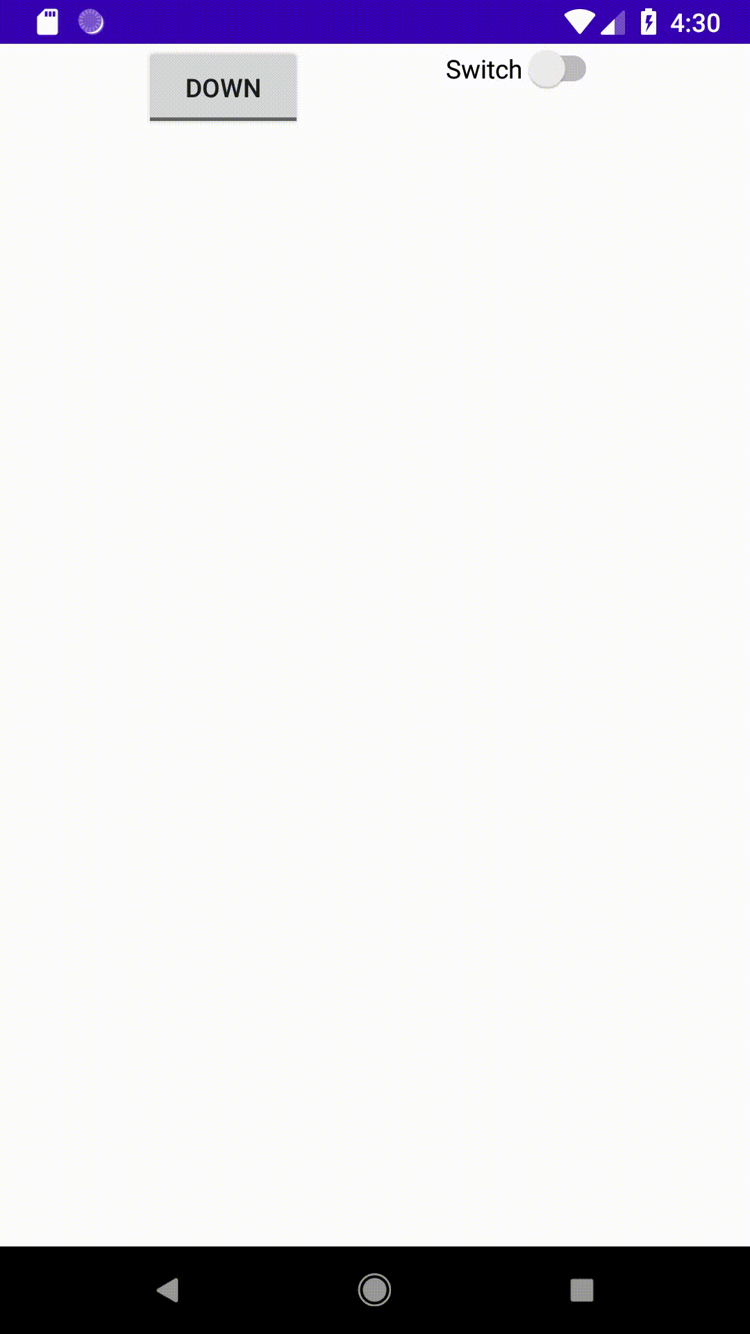
Android는 ToggleButton과 Switch를 통해서 On/off 기능을 제공합니다.
android:textOn="up"
android:textOff="down"
xml 코드에서 textOn과 textOff를 이용해서 ToggleButton의 Text를 바꿀 수 있습니다.
// ToggleButton, Switch Code
package com.professionalandroid.apps.android_practice2

import androidx.appcompat.app.AppCompatActivity
import android.os.Bundle
import android.widget.Toast
import kotlinx.android.synthetic.main.togglebutton.*


class MainActivity : AppCompatActivity() {
    override fun onCreate(savedInstanceState: Bundle?) {
        super.onCreate(savedInstanceState)
        setContentView(R.layout.togglebutton)

        toggleButton.setOnClickListener {
            if(toggleButton.isChecked)
                Toast.makeText(this, "ToggleButton is checked", Toast.LENGTH_SHORT).show()
            else
                Toast.makeText(this, "ToggleButton is unchecked", Toast.LENGTH_SHORT).show()
        }

        switch1.setOnCheckedChangeListener { button, ischecked ->
            if(ischecked)
                Toast.makeText(this, "Switch is checked", Toast.LENGTH_SHORT).show()
            else
                Toast.makeText(this, "Switch is unchecked", Toast.LENGTH_SHORT).show()

        }
    }
}
Activity 코드입니다. 지금까지 봐왔던 코드와 크게 차이가 없으니 천천히 읽어보시면 이해가 되실 것 같습니다.
FloatingActionButton
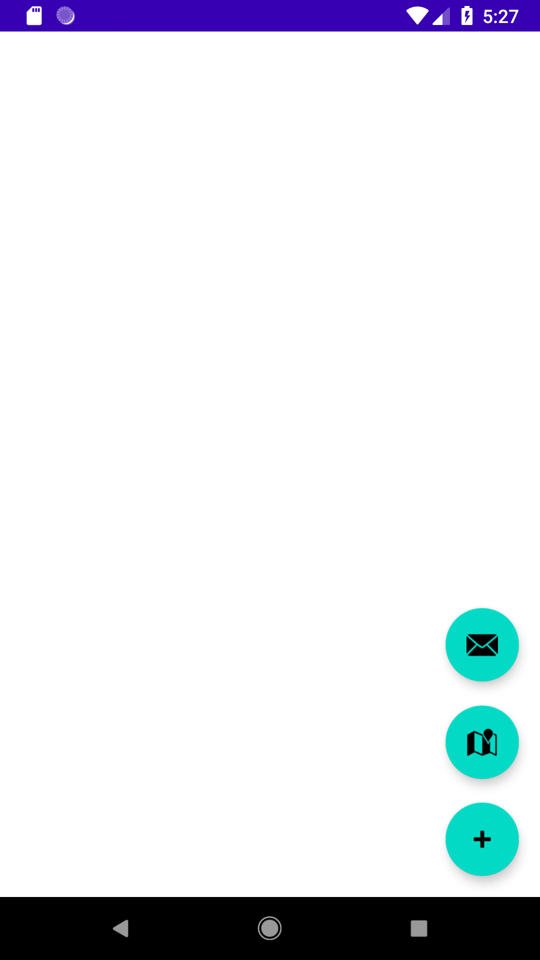
일명 fab라 불리우는 FloatingActionButton입니다. 위 버튼의 유형을 상당히 많이 접해보셨을 것입니다. 하나 말씀드릴 것은 FloatingActionButton의 기능은 없는 버튼을 만들고 없애는 기능이 아닙니다. 세 개의 버튼이 겹쳐있다가 애니메이션 효과로 올라왔다가 내려가는 것입니다. 이 부분은 양이 꽤나 많아 추후에 따로 이야기 하도록 하겠습니다.
이 글은 리토마이어, 이안 레이크, 『Professional Android』, Jpup을 참조하였습니다.
'Android' 카테고리의 다른 글
| API27 에뮬레이터에서 결제 안되는 현상 (1) | 2021.03.14 |
|---|---|
| MultiDex 에러..? (0) | 2021.03.14 |
| Design Palette 훑어보기 - Layout편 (0) | 2020.09.25 |
| Design Palette 훑어보기 - Text편 - 2 (0) | 2020.09.23 |
| Design Palette 훑어보기 - Text편 - 1 (0) | 2020.09.23 |


